
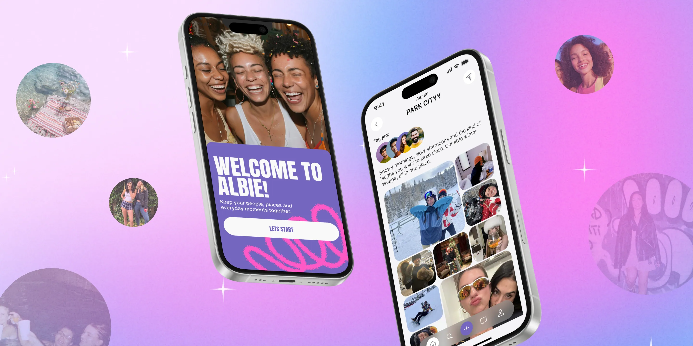
Albie
A social app for creating and sharing photo albums with friends.
- Type
- Concept product redesign
- Timeline
- 2025
- Role
- Product & UX/UI designer
Starting point
The client came to us with an existing social-app concept and early screens. The brief covered both UX and UI: clarify how the product worked and bring the interface into a more cohesive system.
Competitive analysis, interviews, a feature survey and a review of the existing flows shaped three priorities: make albums the core content model, clarify creation and social interactions, and create a consistent visual language across the app.
UX research & strategy
I explored how people store and share visual memories from events and trips.
Instagram, VSCO and BeReal
I compared how established social apps organise and share visual content.
8 participants
We discussed how people collect and share memories from events and trips.
What mattered most
Participants ranked album layouts, tagging, messaging and subscription-based following.
Key findings
People wanted a clearer way to group photos from events and stories.
Traditional single-image feeds felt too linear for shared memories.
They wanted a more personal and interactive way to engage around shared memories.
Design decisions
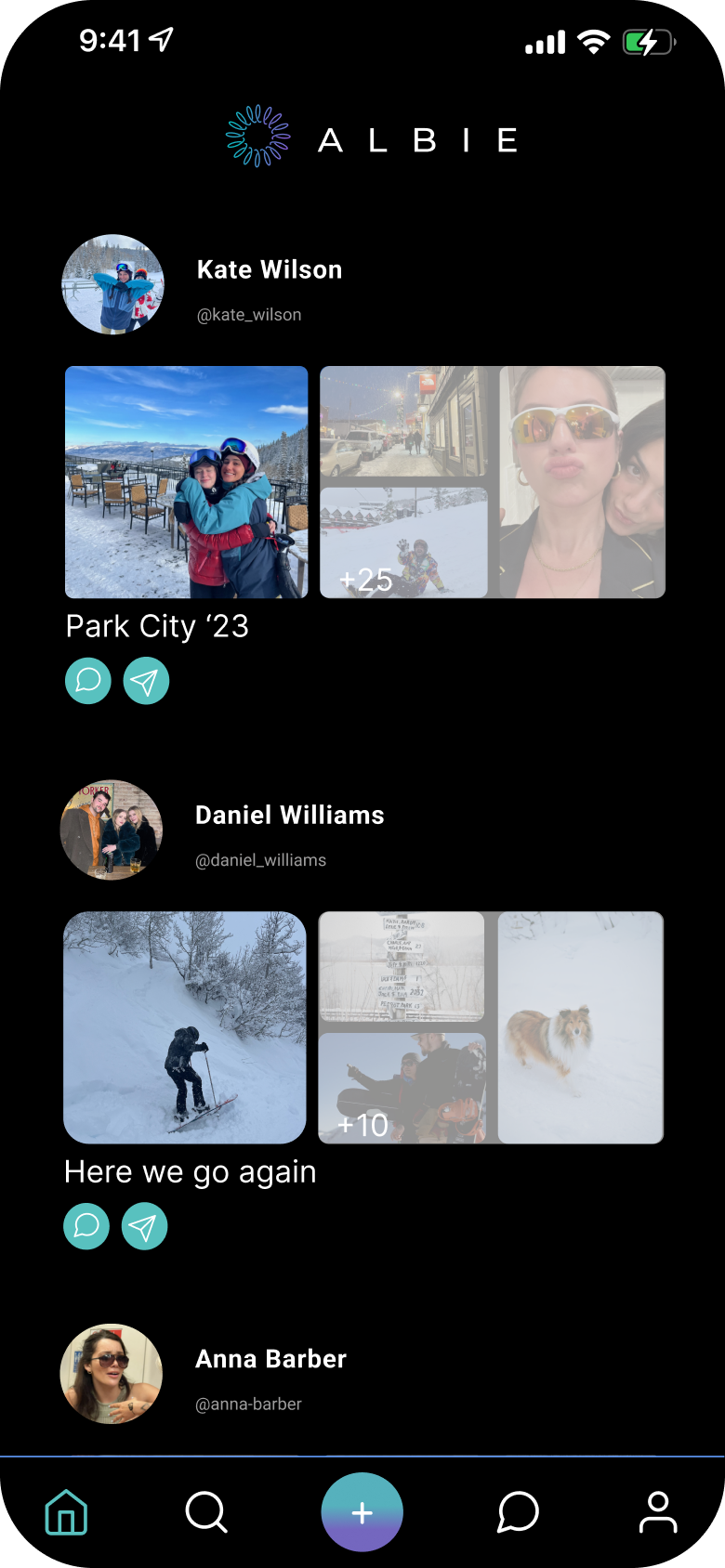
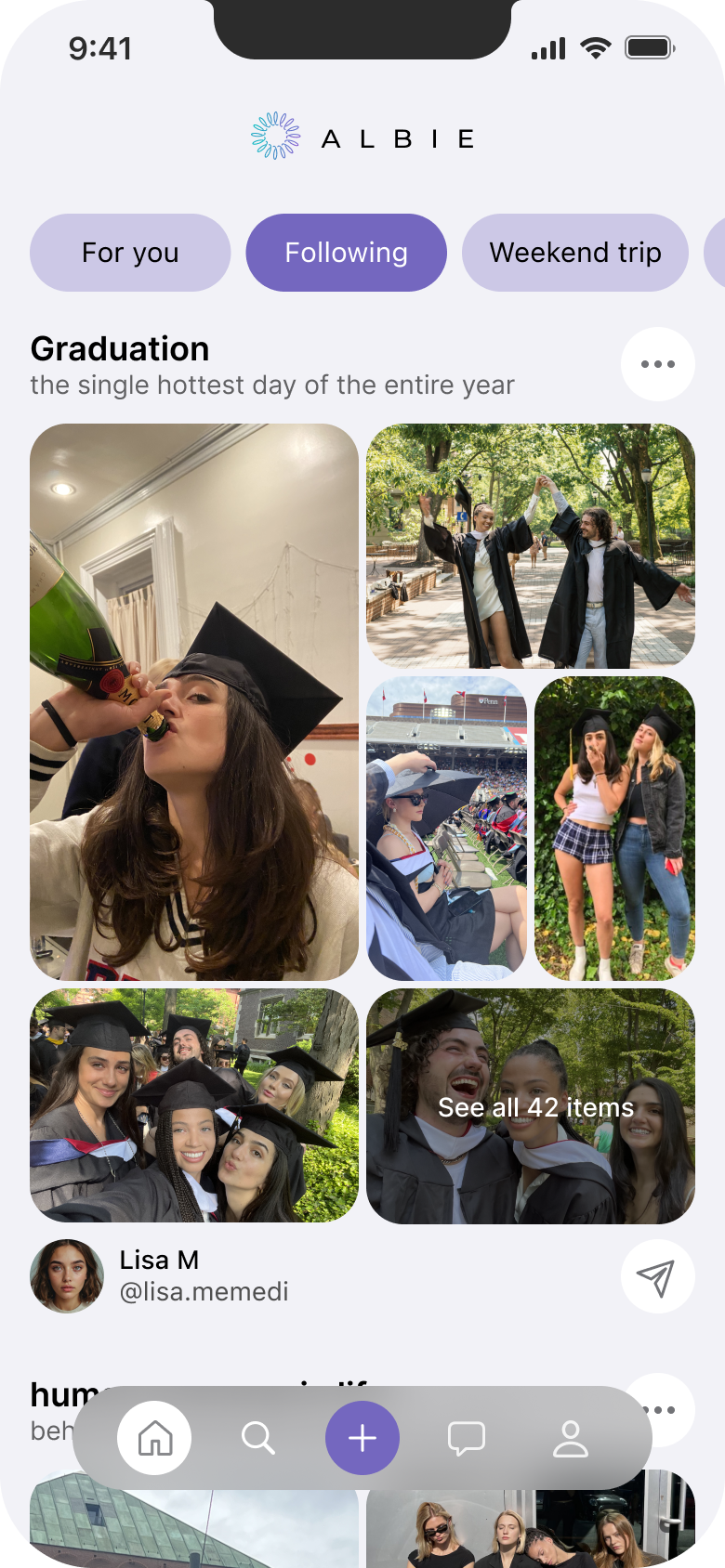
Show the collection before asking people to open it.
Feed previews now carry a title, several photos and the size of the collection, so people can understand the story before they open it.
Hypothesis: richer album previews make context and relevance easier to understand before opening.
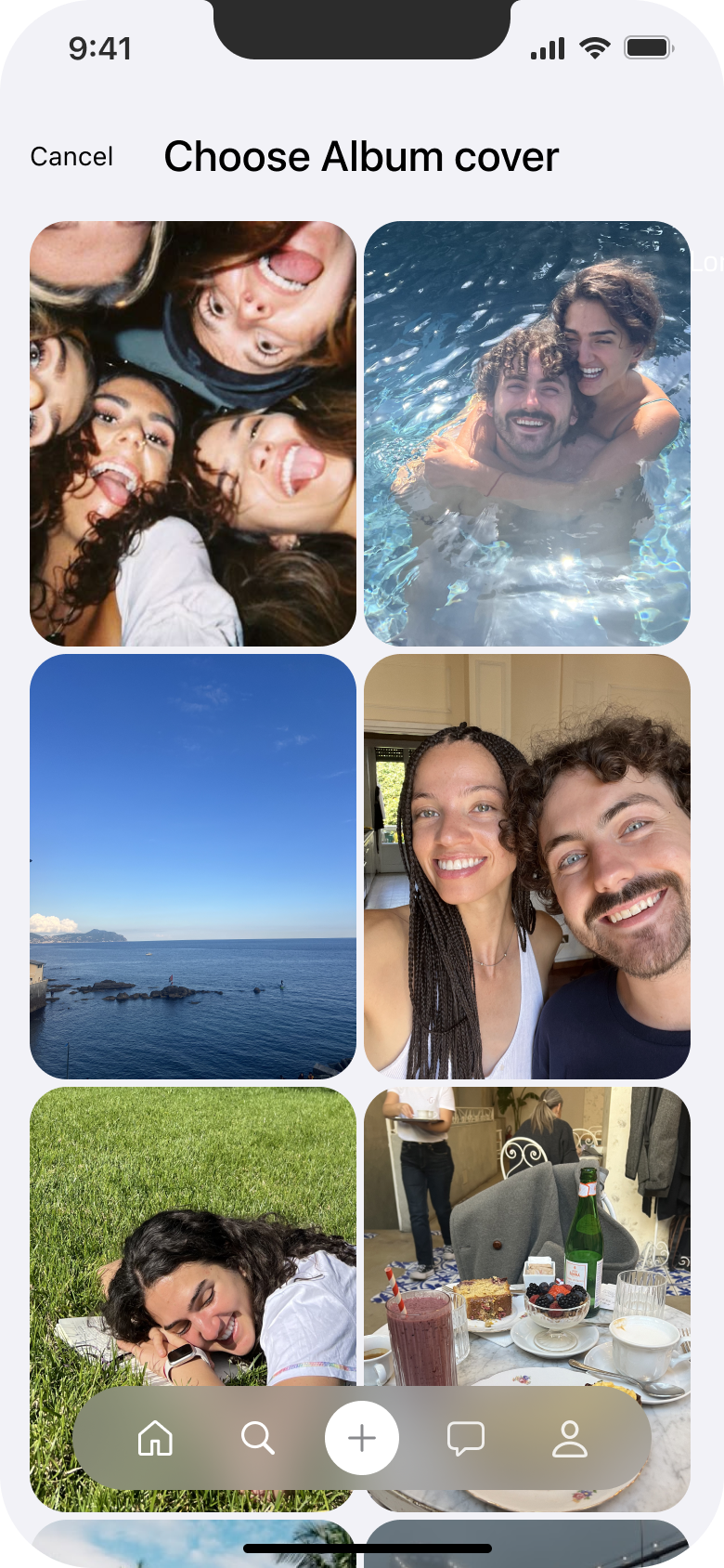
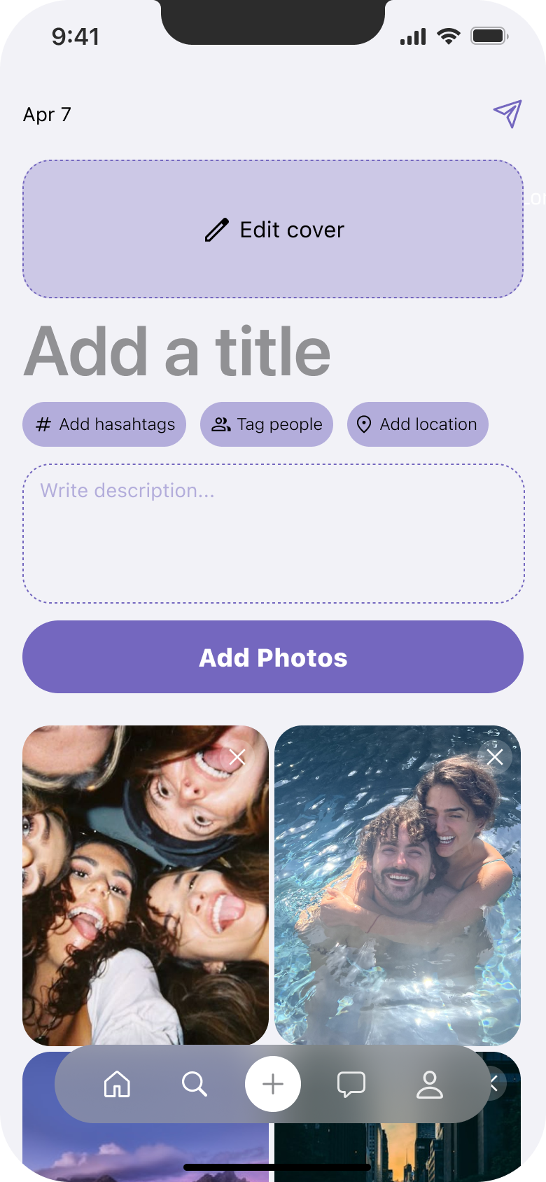
Make photo upload part of creating the album.
After defining the album, people can capture or select a photo, choose its cover and add more moments to the same collection.
Hypothesis: a guided upload flow makes it clear how photos become part of an album without breaking the creation task.

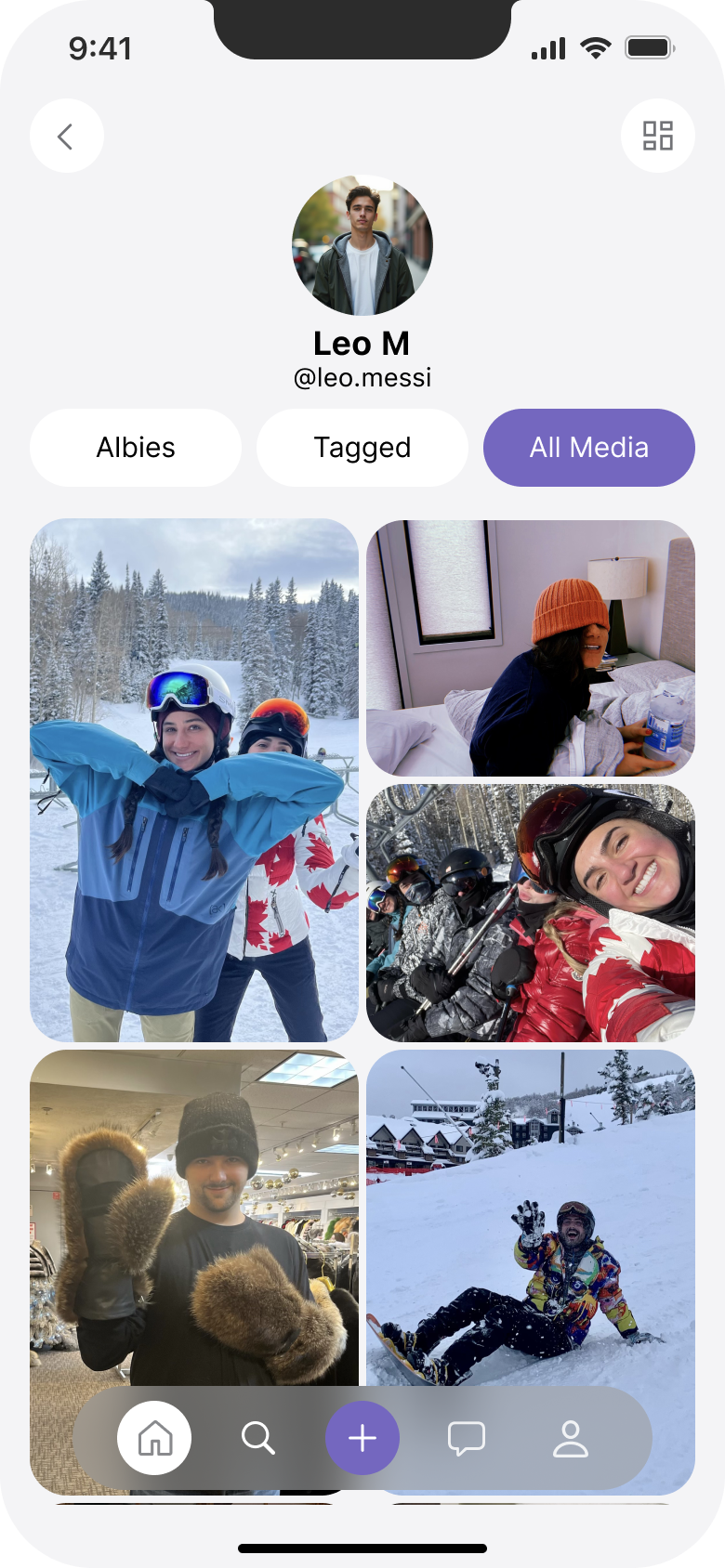
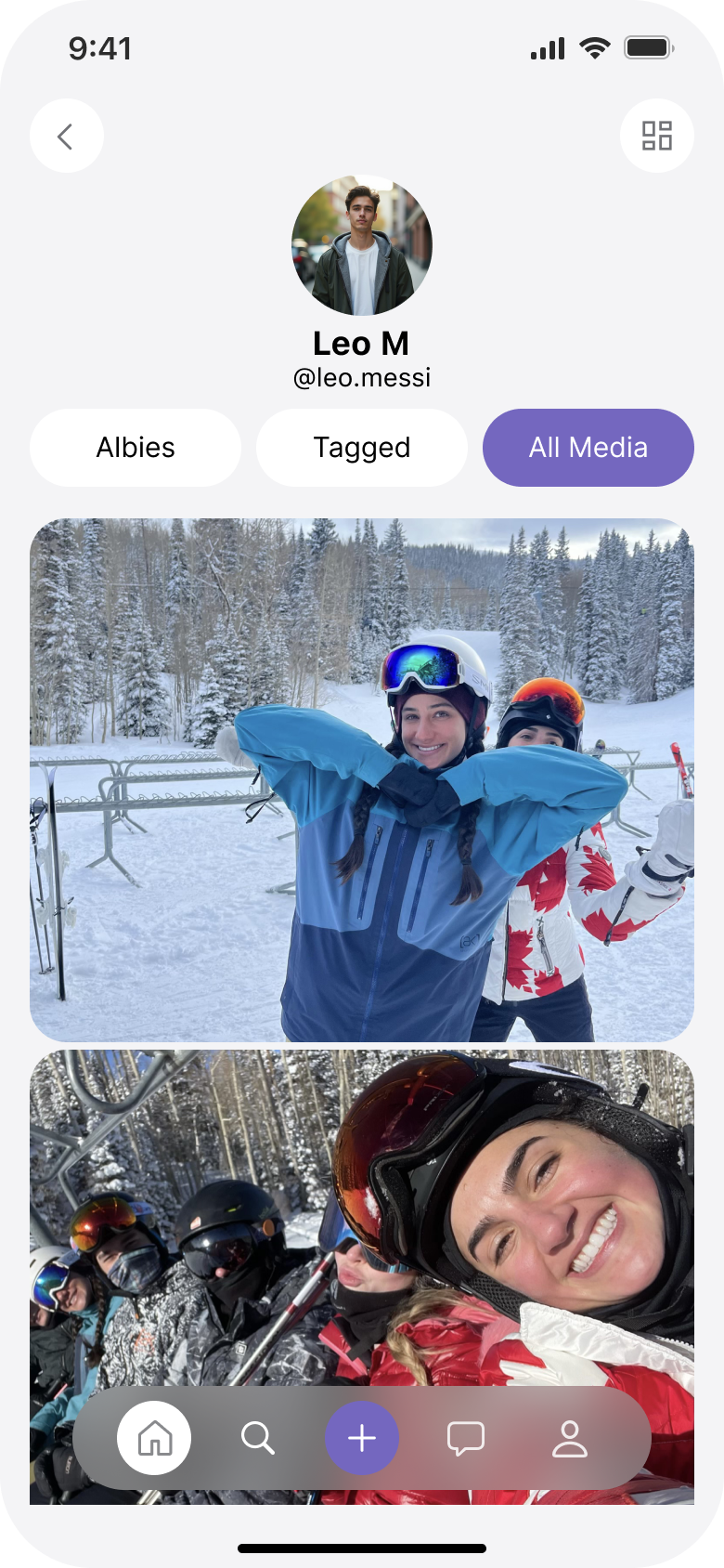
Let the same album work at different levels of detail.
People can zoom out for an overview of the collection or zoom in to make individual moments easier to explore.
Hypothesis: an adaptive grid makes a large album easier to browse without changing its content model.
Success measures
First album published
% of new users who add album details, select photos and complete publishing.
Content interaction
% of album viewers who open a photo, like it or leave a comment.
Notification return
% of recipients who return to the relevant content after a new-activity notification.
Outcome & limitations
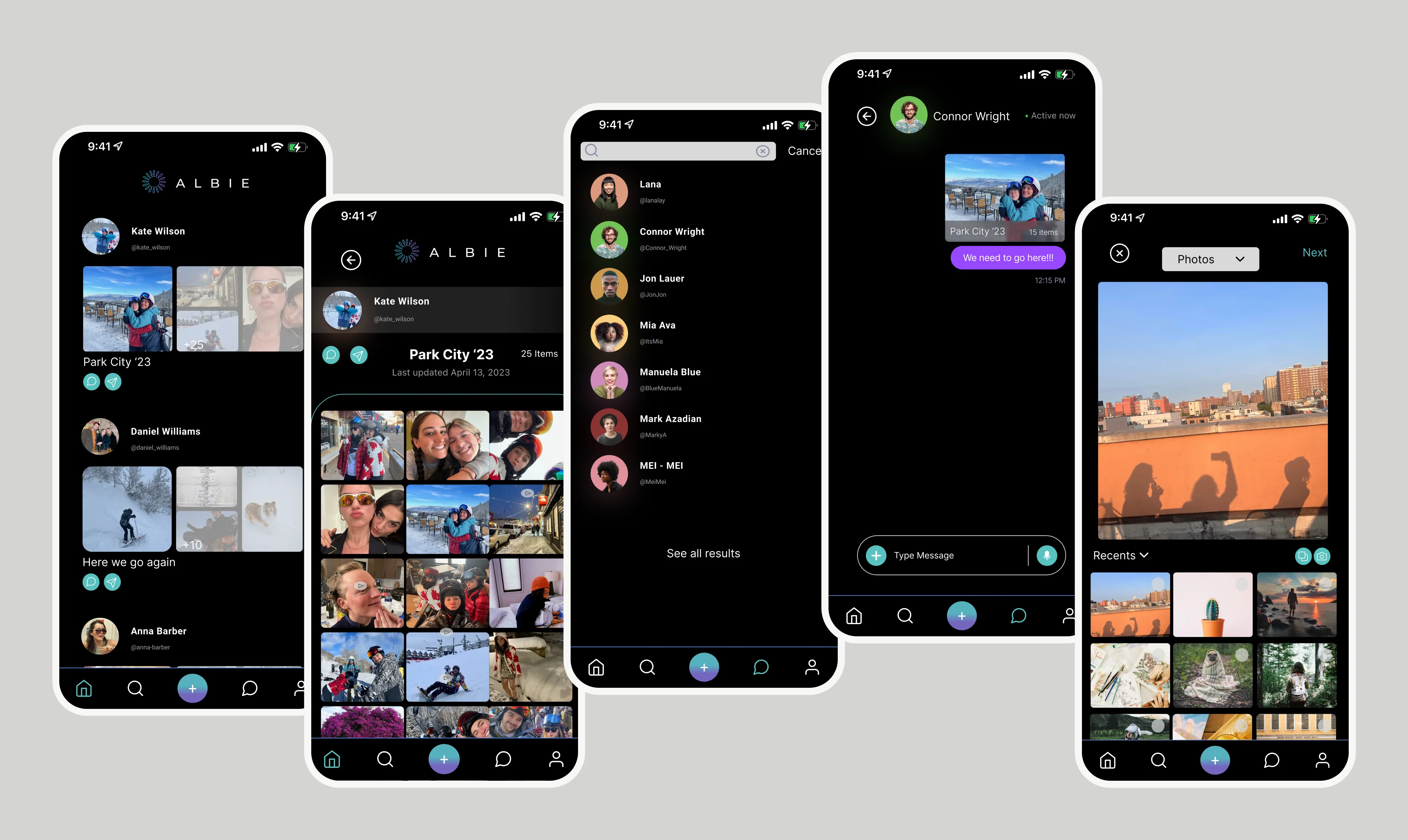
The prototype connects album discovery, browsing, creation, content interaction, notifications, profiles and messaging through a consistent mobile system.
The concept has not been tested or launched, so I cannot claim improved usability, engagement or retention. The value of this iteration is a clearer product direction and a testable set of assumptions.
Next steps
Album mental model
Ask participants what Albie is for after viewing the feed, profile and discovery screens.
Creation usability
Give participants a realistic task: create a trip album, add photos and publish it without guidance.
Return path
Show a content-specific notification and observe where participants expect it to lead.